Utilizing Reporting Tools
Below are two samples of the many free reporting tools available to our clients.
The reporting tools listed below are just a few more of the many that powerful tools we have available for current clients.
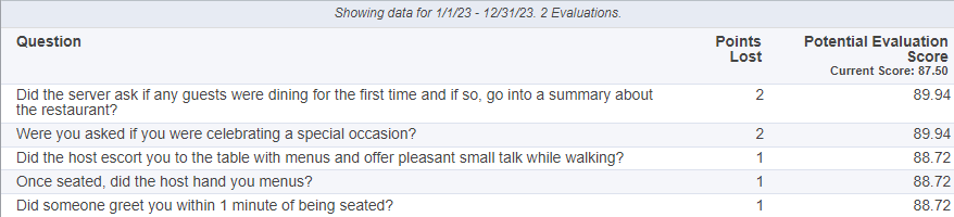
IMPROVABLE QUESTIONS
★ For all shops being displayed, shows the question(s) that have lost the most amount of points over the time period selected.
★ Also shows the potential score is that question had scored 100%
SCORE COMPARISON
Lets you compare the Sections of your Survey to see which section score highest and what sections scored the lowest.

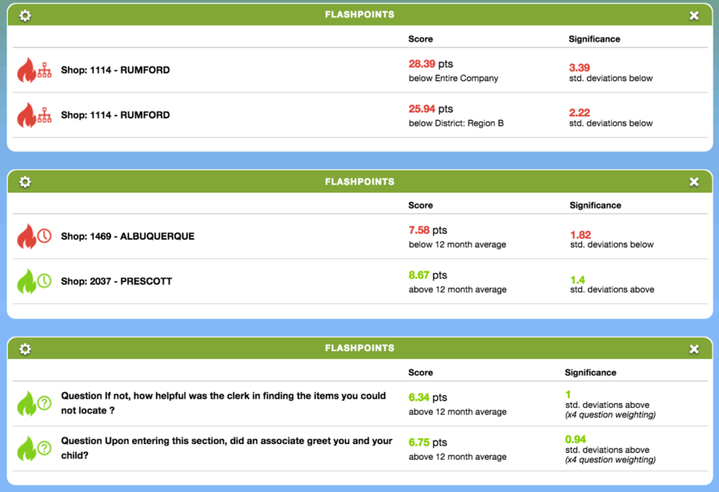
FLASHPOINTS
★ There are 3 types of Flashpoints:
- Level History – Displays level members who differ from their 12 month scores ignificantly.
- Question History – Display question scores that differ from their 12 month average.
- Level Hierarchy – Displays level members who differ from other members of their hierarchy for the current date range.
★ Flashpoints are ordered by most standard deviation to least. Question History values are weighted x4, as smaller standard deviations in question scores have larger real world impact.
★ We use POPULATION STANDARD DEVIATION for calculations.
RECENT EVALUATIONS
★ Shows all shops released in the date range selected.
★ Selecting an individual bubble will open the shop view for that shop
★ Rolling over the bubble will show the shop date of the evaluation, the score, and the level
★ Widget can be filtered by selecting and deselecting level names in the legend.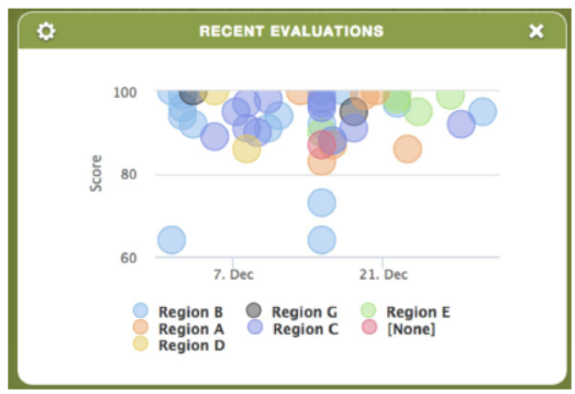
NET PROMOTER SCORE (NPS)
Respondents give a rating between 0 (not at all likely) and 10 (extremely likely) and, depending on their response, customers fall into one of 3 categories to establish an NPS score:
★ Promoters respond with a score of 9 or 10 and are typically loyal and enthusiastic customers.
★ Passives respond with a score of 7 or 8. They are satisfied with your service but not happy enough to be considered promoters.
★ Detractors respond with a score of 0 to 6. These are unhappy customers who are unlikely to buy from you again, and may even discourage others from buying from you.

DRILL DOWN RANKING
★ Shows rank of locations and levels, based on overall, section or question scores.
★ Displays each level shown in order of highest to lowest rank.
★ Ties are displayed with the same rank.
★ The percent rank of a score is the percentage of other scores in its frequency distribution that are the same or lower than it. For example, a score that is greater than or equal to 75% of the other scores is said to be at the 75th percent rank.

COMPANY OVERVIEW
★ The Company Overview widget allows users to view the results of themselves and their peers and drill down to their direct reports.

KEY QUESTIONS
★ Distribution of answer options for a single question.
★ Question percentage score (Example: How long did you spend in the store?

TRENDING-LEVEL
★ Shows level trending for the user’s level or levels that report to them; the user can zoom in on areas of the graph of interest and select and deselect levels using the legend at the bottom of the graph.

TRENDING-LEVEL YEAR OVER YEAR
★ See what’s trending
★ Year vs. Year Results

SURVEY SUMMARY
★ Displays the information of a Single Survey
★ It shows you a breakdown on what was answered and the scoring
★ You get to see which questions need improvement

TOP X – BOTTOM X
★ Can be configured to show the top performers and lowest performers for overall or sectional scores for levels
★ Can be set to a specific level
★ Can be set to show only the top or the bottom
★ The dotted line represents the overall company average.

QUESTION CORRELATION
★ Statistical relationship between two scores
★ Which questions are driving the results of other questions?
★ Ordered from most highly correlated to least correlated
★ Correlation ranges from 0% to 100%

QUESTION CROSS TAB
★ Select two questions and reveal correlations between their answers.
★ Among shops where “rate the cleanliness of the sporting goods section” was answered “Great”, 94.29% also answered “Yes” to “did the cashier ask if you had any coupons”.

SCORE WIDGET
★ IconoGraph Custom Score Thresholds: This new update allows you to show specific images for specific score “thresholds”. Think an image of a cute puppy for 100% and an angry image of Angry Bird for anything less than 80%.
★ Custom Heat Map colors: This new update allows for complete freedom to configure what colors you want to display for scores.

SECTIONS BY LEVEL
★ For the levels selected, compare sectional scores.

TRENDING-QUESTIONS
★ See One Or More Questions Trended
★ See Possible Correlations

TRENDING-SECTIONS
★ Shows each section, trended over the date range selected

TOP X – BOTTOM X MOVERS
★ Can be configured to show the top performers and lowest performers for overall or sectional scores for levels
★ Can be set to a specific level
★ Can be set to show only the top or the bottom
★ The dotted line represents the overall company average.

TRENDING – DRILLDOWN RANKING
★ Displays each level shown in order of highest to lowest rank. Ties are displayed with the same rank. Peer levels are shown in gray and cannot be drilled.
★ The percent rank of a score is the percentage of other scores in its frequency distribution that are the same or lower than it. For example, a score that is greater than or equal to 75% of the other scores is said to be at the 75th percent rank.

IMPROVABLE SECTIONS
★ Shows a percentage of answer options.
★ Section Score: Percentage of possible score achieved for this section
★ Potential Impact: If this section was scored perfectly, your overall score would have increased by the shown amount

TRENDING – NET PREMOTOR SCORE
★ Displays rendering data for Net Promoter Score®. Three graph types are available: Line, Stacked Bar, and Bar. Like the standard NPS widget, it’s typically used for “Would you recommend?” and “Would you return?” types of questions with answers from 0-10, but can technically be set to use any multiple-choice question with 11 answer options.